Card Grid
Authored agenda-style card rows for concise topic lists, initiative maps, or grouped links.
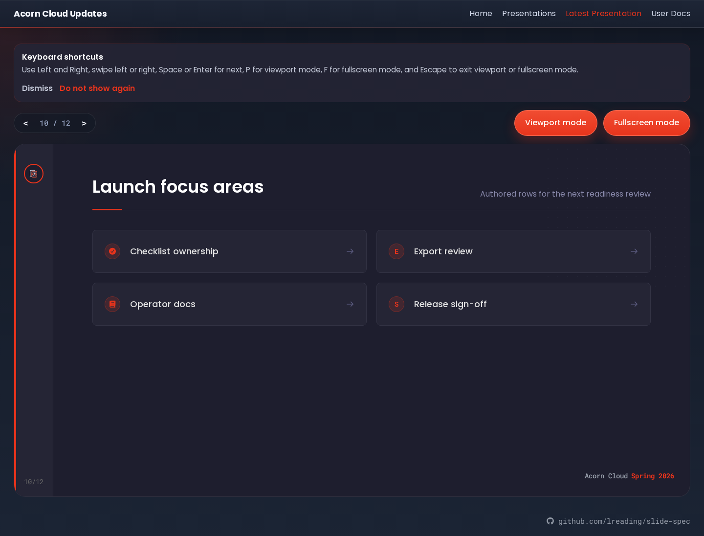
Example
yaml
- template: card-grid
  enabled: true
  title: Initiative areas
  subtitle: What I considered while building the roadmap
  content:
    card_arrow_fa_icon: fa-arrow-right
    items:
      - title: Detection / Response
        fa_icon: fa-shield-halved
      - title: Supply Chain
        marker_text: B
      - title: Documentation
        url: https://www.slide-spec.dev/
Data sources
| Region | Source |
|---|---|
| Cards | content.items[], rendered in authored order |
| Marker | marker_text, fa_icon, or a default 2-digit row number |
| Card link | url, when present |
| Arrow icon | content.card_arrow_fa_icon, when present |
Fields
| Field | Required | Type |
|---|---|---|
title | yes | string |
subtitle | string | |
content.card_arrow_fa_icon | string | |
content.items | yes | array |
content.items[]
| Field | Required | Type |
|---|---|---|
title | yes | string |
marker_text | string | |
fa_icon | string | |
url | string |
Set either marker_text or fa_icon on a card, not both. If both are omitted, the card uses its 1-based row number. When url is set, the whole card becomes a link. Set content.card_arrow_fa_icon only when every card should show a trailing arrow icon. Icon fields use supported values from the Font Awesome icon reference.